|
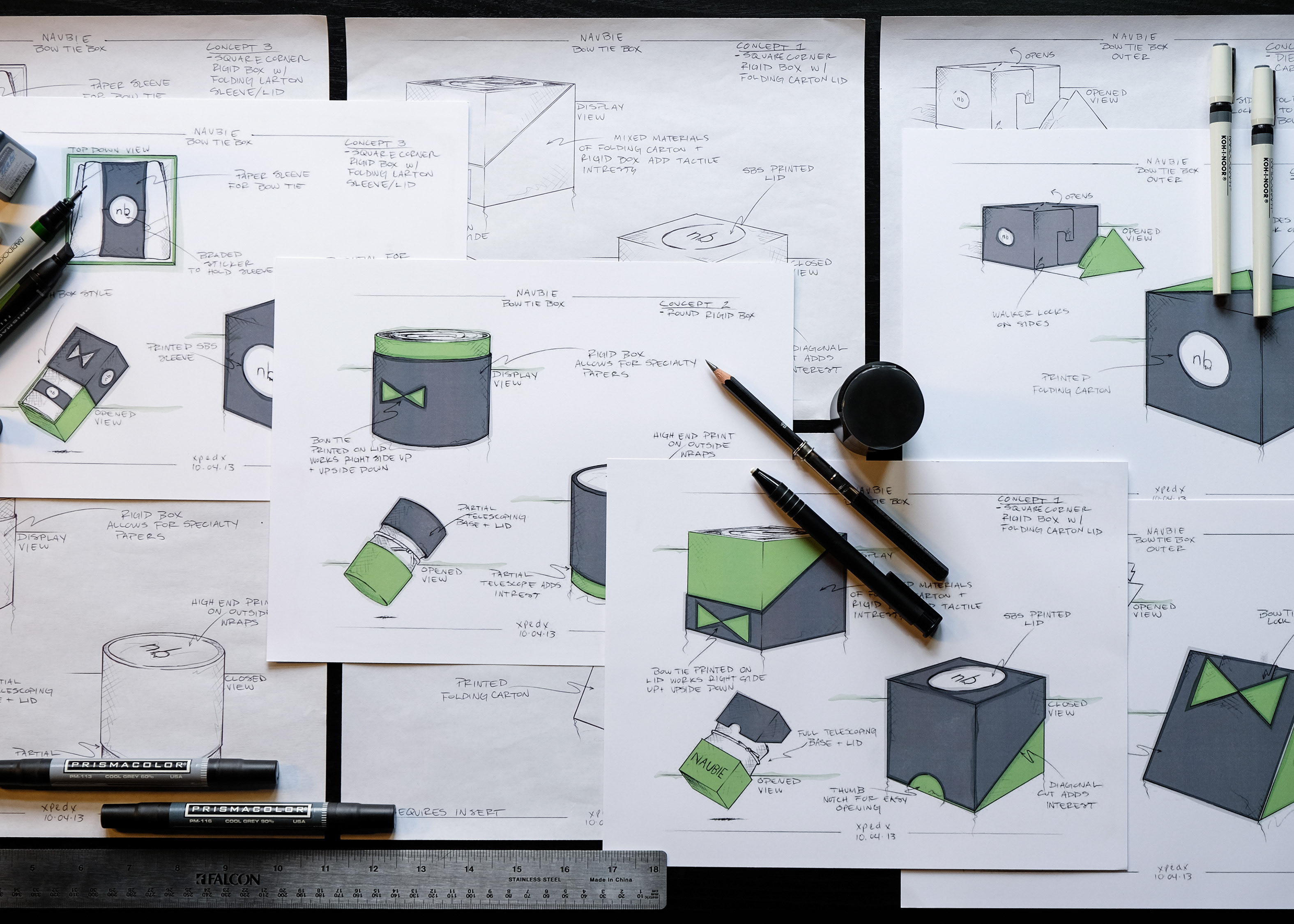
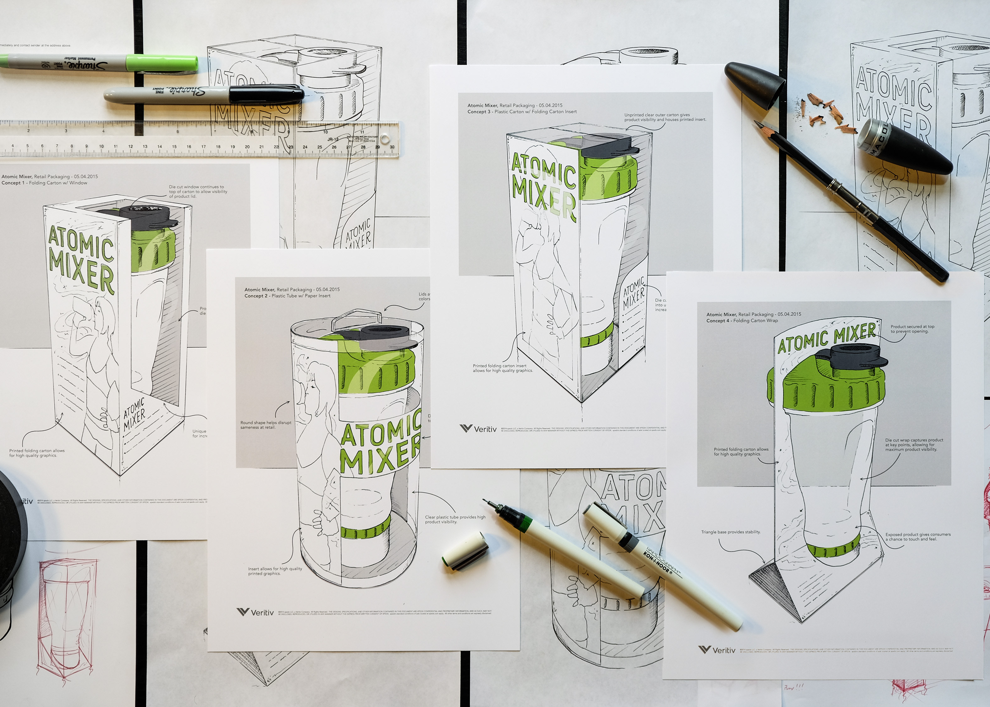
Copper John was looking to get their compound bow release aids onto retail shelves and needed a bit of help formulating a plan to do so. I've included detailed descriptions of the project brief and thought processes behind the sketches (seen above and below) that were pitched to Cooper John for their retail packaging.
Concepts were based around a couple main touch points that were communicated inside of the design request. Product visibility, easy opening and closing at retail and space for branding/graphics. Since the product will be held behind the counters while at retail we have a bit more leeway with how the package closes, as pilferage will be less of an issue, but we have to make sure that the product and graphics are much tighter and highly visible. Primary messages and graphics should be bold and eye catching as consumers will have to be drawn to the package and product from a distance. Secondary information can be placed on the sides and back of the carton as the package will be in the consumer's hands before they would ever have the opportunity to read into it.
Concept 1: This concept mirrors what the customer already had in mind with the package. An acrylic case with some sort of insert and some paper materials for graphics and branding. Acrylic case is likely our best bet here. While the quantities are pretty good the costs to set up and make custom cases of this type can be extremely high. Not to worry though as there are plenty of stock options out there to chose from. As described in the brief we've included the hinged lid and a clasp closure. The clasp closure is pretty commonplace in this type of case and will allow the retailer and/or customer to easily open and close the box to inspect the product before purchase. Rather than do a rounded corner case we are advising that a squared case be used. The rounded corners limit the ways we can go about getting printed materials in the case. For the product insert we are recommending that a custom foam or plastic piece be fabricated. Foam being ideal here as cost to set up for plastics is much more substantial. The foam or plastic will have much more longevity, a better appearance and a tighter hold on the product as apposed to a paper option. Since the foam/plastic cannot be printed we are pitching that a couple of folding carton inserts be used to mask the foam and add some branded energy to the package.
Concept 2: Is a 3 piece package. You have a standard folding carton slipcase, tucks on one end open on the other, over top of a straight tuck folding carton box with a foam (or plastic) insert dropped into it. The slipcases features a die cut window in the shape of the product so the customer can compare colors and features while the product is still inside of the box. The nice thing about isolating only the product in the window is that it masks the rest of the package's seams, lines and imperfections, giving it a really clean look while on shelf. The inner carton, housed in the slipcase, protrudes outside slightly which gives the retailer/consumer an easy handle to grab and remove the product without the need of unsightly thumb notches, etc. Again lending to the clean overall look of the package. A foam insert is dropped inside of a die cut hole punched in the inner carton. The foam, again, is being pitched as cost to set up for plastics is much more substantial. The foam or plastic will have much more longevity, a better appearance and a tighter hold on the product as apposed to a paper option. The accessory bag easily hides away under the foam insert inside of the inner carton. Both the inner and outer carton can receive high quality, full color print.
Concept 3: A sturdy, paperboard, rigid set up box is the base for this design. Set up boxes are know for their longevity, perceived value and high quality nature (think apple iphone box). By using a very heavy chipboard material, wrapped in high quality custom printed paper, we insure that the package screams craftsmanship and can stand up to the rigors of repeated use. Over top of the rigid box base we've included an ultra clear folding sleeve which gives the product maximum visibility. The matchbook style sleeve slides on and off of the package easily lending to the overall unboxing experience. The product is placed on top of a single layer folding carton card with a pull tab for removal. This card allows for printed graphics on the front facing while simultaneously hiding the accessory bag. This concept boasts the smallest footprint of the three options as it does not require a foam, plastic or folding carton insert to hold the product in place. The entire packaged is sized down around the product snuggly which prevents it from moving and getting damaged or looking poorly while at retail. The smaller footprint reduces necessary shelf space allowing more to be displayed at retail. It also saves costs on shipping and storage through its economical use of space.
Concept 4: Is standard through and through. Your run of the mill straight tuck folding carton outer box with die cut window and window patch with a fifth panel for hanging while at retail. This outer carton is bare bones for a reason. It's very common, easily manufactured and predictable, thus making it an inexpensive option. The hang tab give retailers the option to peg the packages if flat shelf space is not available. We can add some interest to the package by adding unique die cuts to the window and eye catching graphics. The inner tray also made out of folding carton and can receive print. It is a frame-vue style which means that it has those walls surrounding the product framing it in. This style is usually used to distinguish quality products from there competitors as the framing feature adds perceived value to the package. Inside of the frame-vue tray you once again have a foam insert for the reasons previously described. This package is definitely a safe bet.
|

